Beauty after 50
Why Blusher Starts Looking Wrong After 50
As skin and bone structure change, the same blusher you’ve always used can suddenly look heavy, muddy or ageing—here’s how to change placement and texture so colour flatters, not flattens.
That small moment of betrayal—when your go-to blusher suddenly makes you look tired—happens to more women than you’d think. It isn’t a moral failing or a sign you should stop wearing colour. It’s the result of predictable shifts in skin, soft tissue and bone that change how pigment reads on the face. The solution is simple: change the angle, soften the texture and apply with lift in mind.
Why blusher goes wrong after 50
Facial architecture shifts. As soft tissue descends and the midface loses roundness, placing colour on the low “apples” can visually pull the face downward and exaggerate jowls and nasolabial folds.
Texture changes too. Crepiness, fine lines and drier skin make heavy powders settle and look chalky or patchy. Where a matte compact used to look airbrushed, it can now read as powdery.
Light and contrast change. Thinner, less reflective skin alters how pigments appear. Very bright or very matte shades can read harsh; muted, skin-like tones tend to look fresher.
How to think about placement now
Lift, don’t drop. Aim higher and more lateral than the classic “smile-and-dot” rule. Place colour on the high point of the cheek bone beneath the outer corner of the eye, then sweep gently toward the temple. The visual effect is a subtle lift.
Paint around, not over, the nasolabial area. Colour on the lower cheek accentuates folds and makes the lower face read heavier.
Test with the face at rest. Smiling lifts tissue temporarily; check placement when your face is relaxed so the colour sits where it will in real life.
Texture and formula choices that work
Avoid heavy matte powders where possible: they tend to emphasise texture and lack movement.
Opt for cream, gel or powder-to-cream hybrids that can be patted into the skin. These melt with skin temperature, look less like a patch of colour and are less likely to settle into fine lines.
Use sheer, buildable pigments. They let you create dimension gradually instead of blocking on colour.
Skip chunky shimmer. A soft satin or micro-luminous finish will brighten without highlighting texture.
Application essentials
Prep is not optional. Hydrated skin accepts pigment more evenly. Use a light moisturiser or hydrating primer and avoid over-powdering the apples.
Pat, don’t sweep. Use a fingertip, damp sponge or dense stippling brush to press product into the skin. This softens edges and prevents streaky lines.
Blend outward and upward. Start at the high cheek and feather toward the temple; the aim is movement, not a circular dot.
Keep contrast subtle. A faint shadow under the cheekbone and a delicate top-of-bone highlight can create structure and lift—keep them soft. Stark contour and bright highlight read harsh on mature skin.
Colour direction
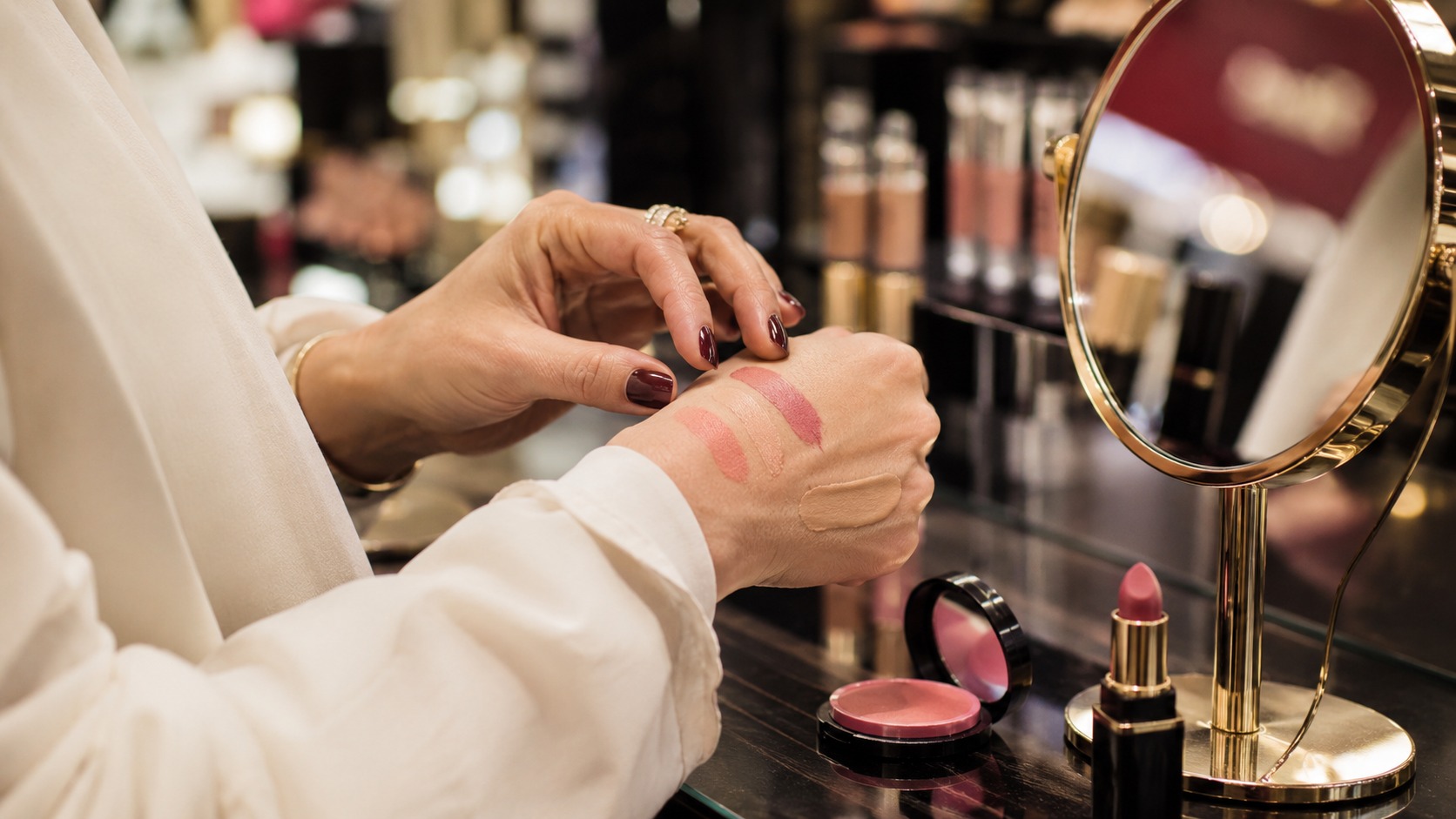
Move toward muted, natural tones: warm roses, soft peaches and tawny neutrals mimic a believable flush and harmonise with shifting undertones.
Always test in natural light. Undertones change with age; a shade that once read neutral may now need a dustier or warmer note.
A practical three-minute mature-cheek routine
1. Hydrate and apply a light base; powder only where necessary.
2. Tap a small amount of cream blusher onto the high point of the cheek beneath the outer corner of the eye.
3. Pat and blend upward toward the temple—less on the apple, more on the bone.
4. If desired, add a whisper of satin highlighter to the top of the cheekbone and set only where needed with a very light translucent dust.
Common mistakes to avoid
Overpowdering the apples, which removes skin’s natural luminosity and leaves pigment sitting on texture.
Using too intense a shade or a heavy matte; both can read as a block of colour rather than a believable flush.
Applying blusher while smiling; placement should be checked with the face at rest.
Final thought
Blusher after 50 isn’t about abandoning colour; it’s about giving colour direction. Shift the angle, soften the texture and apply with lift in mind—and that same rosy idea will read fresher, younger and entirely natural.